

About the author
 Octavia Cephalo
Brand Ambassador
Brand Ambassador
Featured Article

Recent Posts


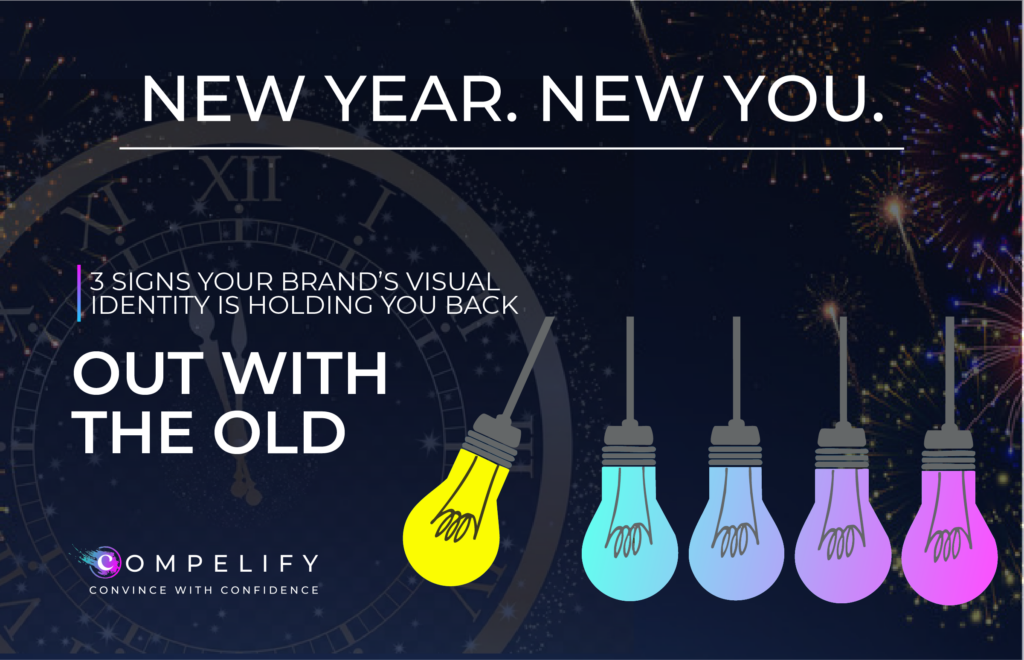
The momentum of the New Year is pushing forward. You’ve set ambitious goals for growth, market penetration, and customer engagement. You have the strategic plan, the talent, and the product. But as you look at your website, collateral, and social feeds, you might have an unsettling feeling: Is our brand holding us back?
Visual identity: your logo, color palette, typography, and imagery, is the public face of your strategy. It’s what communicates your value proposition, personality, and trustworthiness to the market in an instant. If your visuals are outdated, inconsistent, or confusing, they become a silent anchor on your growth, even if your underlying product is stellar.
Compelify understands that redesigning your visual identity is a major investment. But it’s an investment you must make when the costs of not changing outweigh the costs of the redesign itself. As experts in creative strategy, we see three undeniable signs that the time for a visual intervention is now.
1. You've Outgrown Your Original Value Proposition (The Positioning Problem)
Your visual identity was likely created when your company was smaller, your product was simpler, or your target audience was narrower. Brands evolve, but visuals often remain frozen in time, leading to a profound positioning problem.
- The Mismatch: A brand identity that screams “friendly startup” is a liability when you’ve matured into a global enterprise serving Fortune 500 clients. A playful, cartoony logo designed for a local market doesn’t convey the sophistication needed to sell complex enterprise software globally. Your visuals must match your current (and aspirational) market position.
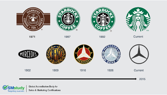
- The Simplification Trend: Many successful companies, like Starbucks and MasterCard, have simplified their logos over time. This isn’t just about fashion; it’s about scalability and functionality. Complex logos struggle on small digital screens and fail to translate across global markets. If your logo is difficult to render clearly on a social media icon, a favicon, or a partner’s co-branded asset, it’s structurally holding you back.
- The Niche Trap: Did your company name or original logo explicitly refer to a product or service you no longer focus on (e.g., a “print house” that now focuses on digital content)? If your identity ties you to an outdated niche, it actively prevents prospects from understanding your current, broader offering.
The Test: If a prospect looks at your logo and guesses what you do incorrectly, or worse, assumes you are smaller or less capable than you truly are, your identity is failing the positioning test.
2. Your Brand is Visually Inconsistent (The Trust and Recognition Problem)
Consistency is the bedrock of brand recognition and customer trust. When your visual identity is fragmented, you force your audience to work harder to recognize you, leading to reduced trust and wasted marketing spend.
- The Toolkit Chaos: Do your teams rely on multiple versions of your logo or use a dozen different fonts and shades of your primary color across internal and external documents? This chaos is symptomatic of a lack of robust Brand Guidelines. Without clear rules, every new designer or agency starts from scratch, diluting your visual equity.
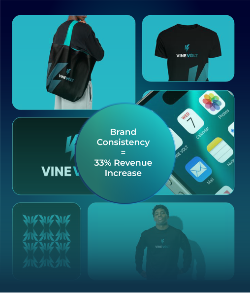
- The Platform Drift: Your website might look sharp, but does your LinkedIn banner match your Instagram aesthetic, and does either align with your latest downloadable PDF? This platform drift creates cognitive dissonance. Studies show that consistent brand presentation across all platforms can increase revenue by up to 33% [1]. Inconsistency signals disorganization and lack of professionalism.
- Accessibility Failure: Outdated branding often fails to meet modern Web Content Accessibility Guidelines (WCAG) standards. Poor color contrast (e.g., light gray text on a white background) not only excludes a portion of your audience but suggests a lack of sophistication and compliance. An inaccessible visual identity is a legal and ethical liability.
The Test: Conduct a visual “scavenger hunt” across your oldest and newest collateral. If the pieces look like they came from two different companies, your identity lacks the cohesion required for sustained momentum this year.
3. Your Visuals Are Simply Dated (The Credibility and Technology Problem)
In the digital world, design trends change quickly, and while you shouldn’t chase every fad, being dramatically behind the curve instantly damages your credibility. A dated aesthetic suggests that your technology, thinking, and product are also dated.
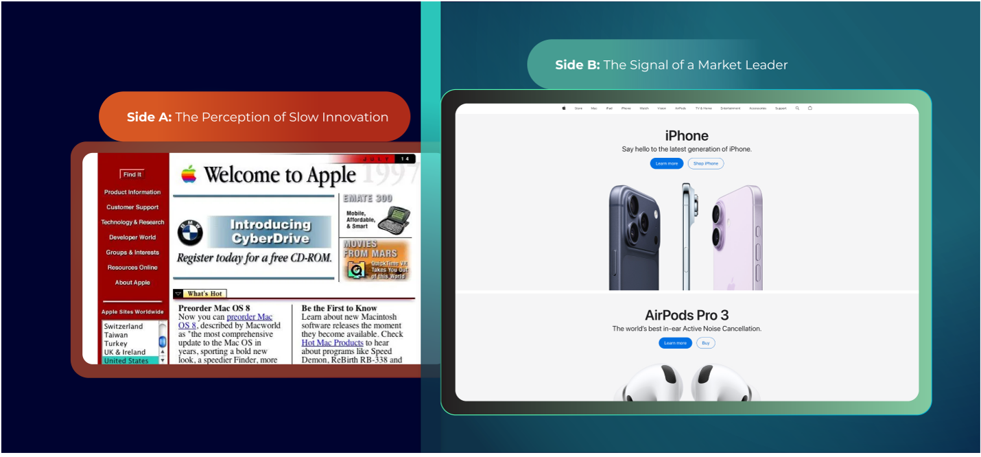
- The Technology Signal: Current design favors simplicity, clean lines, clear hierarchy, and functionality (UX). Outdated designs often feature skeuomorphism (designs that mimic real-world objects, like digital buttons that look like leather), excessive gradients, or difficult-to-read, busy backgrounds. If your site looks like it was built before the latest mobile design standards, prospects will assume your product development moves at the same speed.
- The Competitor Bar: Your visual identity is judged relative to your competitors. Look at the brands entering your space: they are launching with modern, agile, and mobile-first visual systems. If your logo and color palette make you look like the established, slower alternative, you will lose momentum to newer, visually sharper competitors.
- The Talent Drain: High-quality talent, from engineers to marketers, is attracted to innovative, modern brands. An outdated visual identity can quietly undermine recruitment efforts, as it fails to signal the progressive, dynamic culture you need to succeed.
The Test: Ask a recent hire or a prospective customer for their immediate, unvarnished impression of your visual identity. If the first words are “old-school,” “busy,” or “corporate,” your visuals are actively driving the perception of a slow, less innovative company.
Momentum Starts with a Modern Identity
Your visual identity is an asset that must be managed, maintained, and strategically updated. It is the language that tells the market where you are going. If your current visuals are tied to where you have been, they are holding you back from achieving the New Year, New Momentum you planned for.
Compelify specializes in strategically modernizing visual identities to unlock new growth and support ambitious business goals. We ensure your new look is not just beautiful, but functional, scalable, and entirely aligned with your refined value proposition.
Ready to shed the visual identity that’s holding you back?
[→ Schedule your Visual Identity Audit with Compelify to start your brand modernization]
https://compelify.com/lp/newyearnewmomentum
References
[1] Lucidpress. (n.d.). The importance of brand consistency: An ROI study. (Refers to data on consistent branding and revenue increase).
[2] Nielsen Norman Group. (n.d.). Research on Visual Hierarchy and Website Usability. (Refers to ongoing data on design elements and user experience).
[3] Web Content Accessibility Guidelines (WCAG). (n.d.). Contrast Minimum. (Refers to international standards for digital accessibility).
[4] Various Marketing Research Firms. (Ongoing). Reports on Digital Design Trends and Brand Perception. (Refers to general industry observations on outdated aesthetics and credibility).