

About the author
 Octavia Cephalo
Brand Ambassador
Brand Ambassador
Featured Article

Recent Posts


The “New Year, New Momentum” energy reminds us that the only constant in business is change. Your company is not a static entity; it is a living system that will launch new products, pivot to new markets, and embrace new technologies.
Yet, most brand identities are designed as rigid artifacts perfect for a single moment in time but destined to feel dated or restrictive within five years. They are built to last but not built to flex.
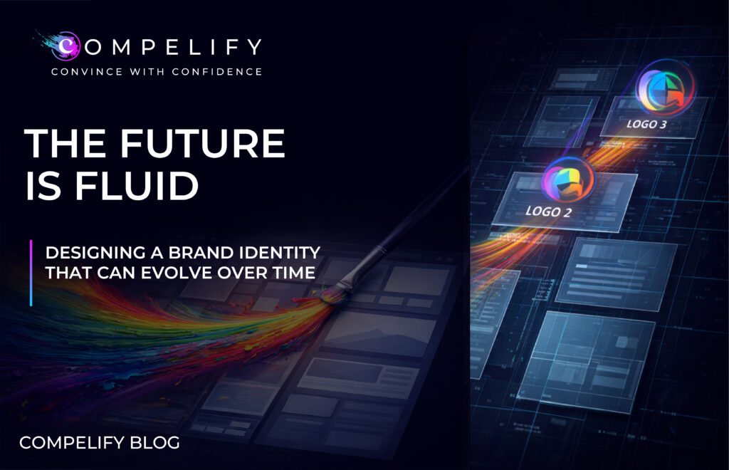
Compelify specializes in designing brands that are not just beautiful, but strategically fluid. We understand that the cost of continuous, full-scale rebranding every few years is unsustainable. The future of brand strategy lies in creating a core visual system that is robust enough to maintain recognition but adaptable enough to evolve without costly surgery.
This is the philosophy of the Fluid Brand Identity, a design system that moves with your strategy, not against it.
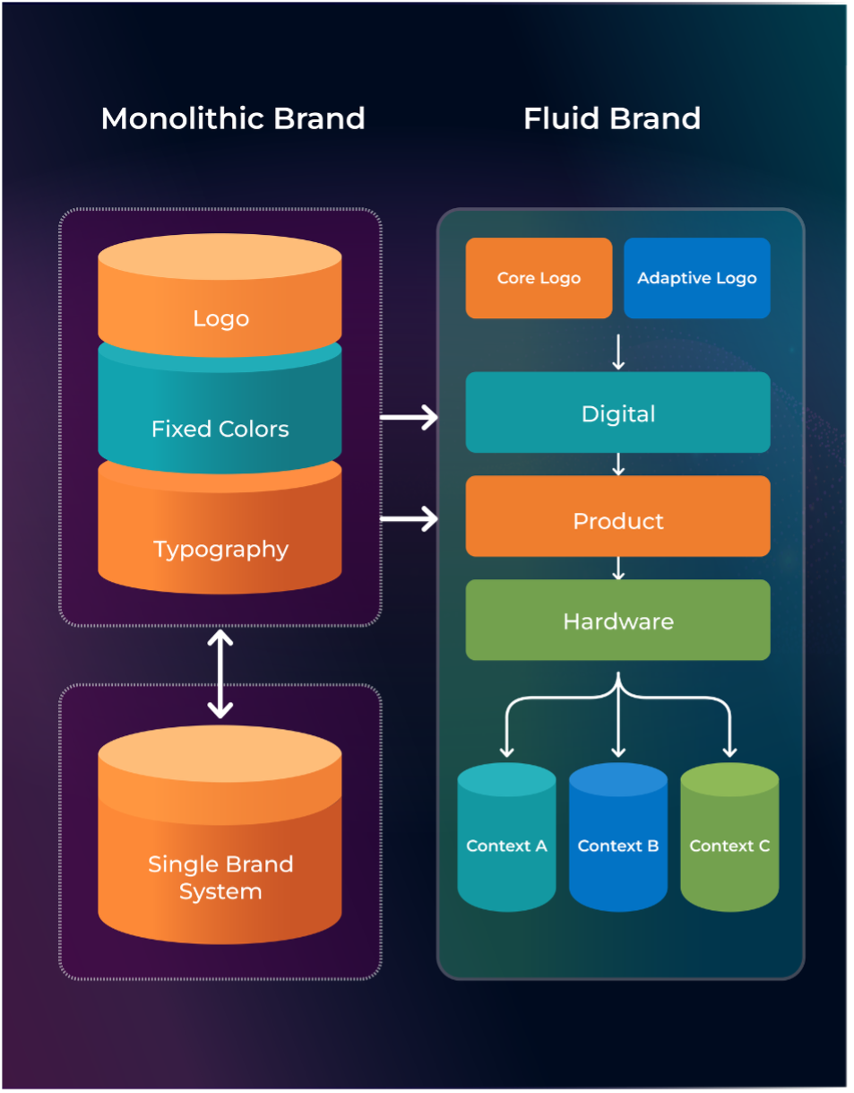
The Problem with the Monolithic Brand
Traditional branding focused on a monolithic identity: a single, fixed logo, a rigid color palette, and one unchanging tagline. This approach creates three major liabilities in today’s fast-moving environment:
- Restriction of Product Lines: A brand heavily tied to a single product or feature (e.g., a “cloud” logo) becomes a restrictive liability when the company expands into physical hardware or services.
- Inability to Adapt to Digital Contexts: A complex, fixed logo may look beautiful on a business card but fail entirely on a tiny mobile screen, a favicon, or a wearable device.
- Visual Fatigue: A static identity can quickly lead to visual fatigue in the market, making the brand feel repetitive or old-fashioned when competitors are constantly refreshing their communication.
The goal is to design for recognition without designing for restriction.
The Fluid Framework: 4 Pillars of a Flexible Identity
A Fluid Brand Identity is not just a logo; it’s a living design system built on adaptable components. Here is the Compelify framework for designing for evolution:
- The Adaptive Logo System (The Core Identity)
The logo should be treated as a family of assets, not a single file. The core element must be instantly recognizable, even when simplified.
- The Primary Mark: The most complete version, often used for official documents and large displays.
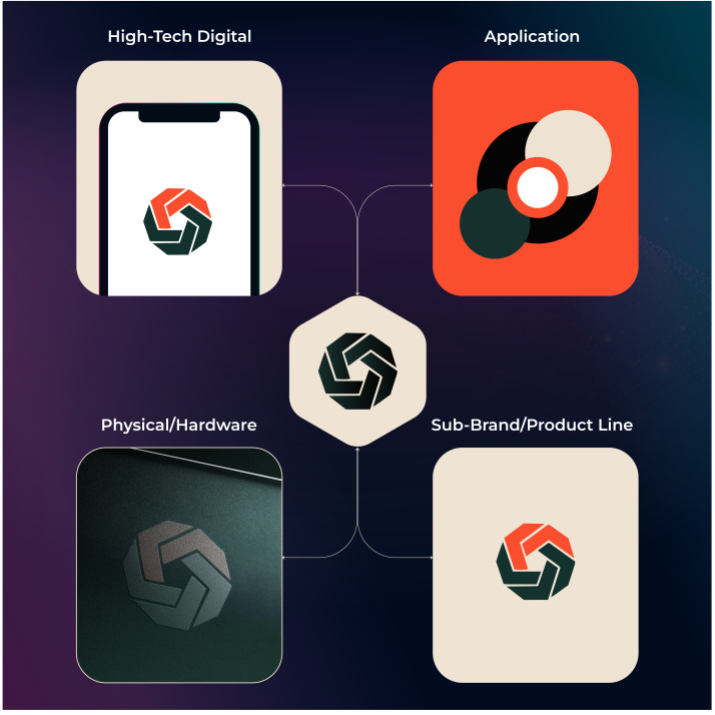
- The Logotype: The name of the company, designed for high legibility.
- The Secondary/Iconographic Mark: A highly simplified version (a symbol or monogram) designed for small digital spaces (app icons, social media avatars, favicons). This icon must carry the emotional weight of the full brand without needing the name.
- Contextual Flexibility: The system dictates when and how the logo can appear in different colors (e.g., white on a dark background) or reduced forms, ensuring it always reads correctly across all platforms.
- Dynamic Color & Typography (The Mood Controller)
Instead of a fixed palette of two colors, a fluid system uses a Primary Anchor (the core recognition color) and a set of Secondary/Extended Palettes that can be utilized to signal different moods, departments, or product lines.
- Color as Signal: The secondary colors can be used to distinguish between product verticals (e.g., green for sustainability products, blue for enterprise solutions) without fracturing the core identity.
- Emotional Range: The system defines a range of acceptable shades and tints. For example, the brand can lean into a deeper, more serious blue for corporate reports but a brighter, more vibrant blue for consumer-facing social media campaigns.
- Typographic Hierarchy: The system uses one core typeface for maximum recognition but defines a complementary font (often a simple system font) for digital body copy, ensuring legibility and adaptability across all devices and load times.
- Purposeful Imagery & Visual Language (The Personality Setter)
A fixed set of imagery can quickly become generic. A fluid brand defines the rules of its visual language, allowing the imagery to change while maintaining the brand’s personality.
- Style, Not Subject: Define the approved style (e.g., “authentic, unposed, and warm” vs. “minimalist, geometric, and abstract”). The actual content of the photos can change as the product evolves, but the stylistic filter remains constant.
- Iconography Library: Build a scalable, comprehensive library of branded icons (in a consistent style) that can be easily updated or expanded to illustrate new features or services without requiring a full redesign.
- Motion Rules: Define how the logo and graphics move. The speed, transition style, and tone of motion graphics (video intros, app loading screens) are now integral parts of the identity that must be governed for consistency.
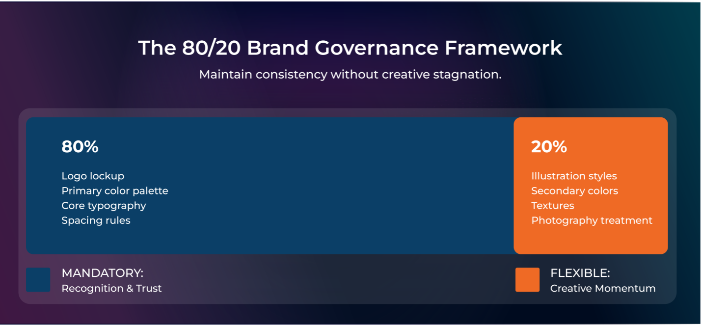
- The Version Control Governance (The System Manager)
A fluid identity requires strict internal governance to prevent chaos. The system must be easy to use but impossible to misuse.
- Modular Brand Guidelines: The guidelines should be digital and modular, functioning like a design component library (similar to a UI design system). This allows teams to access and implement approved components quickly.
- Built-in Flexibility: The guidelines must explicitly define the 80% that is mandatory for recognition, and the 20% that is flexible (where designers have creative freedom, such as illustrative style or secondary color applications). This prevents creative stagnation while guaranteeing consistency.
Momentum is Ready for Change
In the modern marketplace, every company should anticipate change, not fear it. The investment you make in your brand identity this year should last far beyond the current product cycle.
The Fluid Brand Identity is a strategic decision to ensure your visual equity grows stronger—not weaker—as you launch new initiatives. It’s about building a versatile vehicle ready for any road your growth strategy takes you down.
Ready to design an identity that’s built for the future, not just for the moment?
[→ Talk to Compelify about creating your next Adaptive Brand System]
https://compelify.com/lp/newyearnewmomentum
References
[1] Singh, S. (2006). Impact of color on marketing. Management Decision, 44(6), 783-789. (Refers to data on subconscious judgment and color).
[2] Lucidpress. (n.d.). The importance of brand consistency: An ROI study. (Refers to data on consistent branding and revenue increase).
[3] LogoLounge. (n.d.). Annual Logo Trend Reports. (Refers to industry observations on the trend toward logo simplification and adaptability).
[4] Nielsen Norman Group. (n.d.). Design Systems and Consistency in UI/UX. (Refers to principles of modular design applied to brand identity).