We are Your Elite Creative Team To Compel Action

About the author

Octavia Cephalo

Brand Ambassador

Octavia Cephalo

Brand Ambassador

Octavia is a remarkably playful and strategic octopus that brings a unique perspective to our creative team. She expertly navigates the depths of branding, exploring the ocean, and connecting with our audience through lively social media interactions.

Follow Us

Contact Us

Would you like your creative
collateral to be more compelling?

Table of Contents

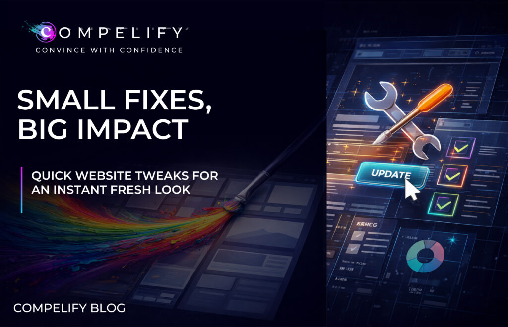
A website rarely fails because of one major issue. It usually underperforms because of dozens of small friction points that quietly shape how users think, feel, and decide.

Most brands assume that improving a website requires a full rebuild. In reality, some of the highest-impact improvements come from simple, strategic adjustments that enhance clarity, reduce cognitive load, and create a more intuitive user journey. These small enhancements repeatedly outperform massive redesigns because they address the way users actually navigate and interpret digital experiences.

If your website feels “fine” but is not converting the way it should, the opportunity is not in adding more features. It is in removing friction. It is in simplifying the path. It is in Compelifying the experience so users understand you faster and trust you sooner.

Here are the powerful, small-scale optimizations that consistently deliver big results in 2026.

1. Simplify Your Hero Section

Clarity Creates Confidence

The hero section is the most influential real estate on your website. Within seconds, users decide whether to stay or leave. They are looking for answers to three questions:

What do you do?
Who do you do it for?
Why does it matter?

When these are clear, users feel immediate alignment. When they are vague or clever, users exit.

A Compelified hero section focuses on:

  • A direct, unambiguous headline
  • A subheader that clarifies value instantly
  • One primary call to action
  • A low-commitment secondary action
  • A clean background that prioritizes hierarchy
  • Immediate scannability

This level of clarity builds trust and reduces bounce rates. The hero is not decoration. It is direction. When users know they are in the right place, they move forward.

2. Improve Readability Through Spacing and Visual Hierarchy

Structure Shapes Understanding

The most underrated website upgrade is spacing. Spacing is not aesthetic. It is cognitive support. It helps users process information more quickly and reduces overwhelm.

Strong spacing improves:

  • Flow between sections
  • The emphasis of key statements
  • The readability of paragraphs
  • The hierarchy of ideas
  • The pace of scanning

Content that feels open and well-structured encourages users to continue reading. When information is crowded or visually compressed, users skip the details that matter most.

Compelified spacing elevates comprehension, which elevates conversion. A clear layout helps your message work harder.

3. Strengthen Your Calls to Action

Direction Drives Decisions

A call to action is more than a button. It is the moment where interest becomes intent. Many websites lose conversions because CTAs are easy to overlook or too generic to motivate action.

High-performing CTAs are:

  • Clear and outcome-driven
  • Visible without overpowering the design
  • Consistent in style, shape, and messaging
  • Strategically placed throughout the page
  • Designed with contrasting color for visibility

“Book a Call” outperforms “Learn More” because it sets an expectation. “See Examples” outperforms “Explore” because it communicates value. A Compelified CTA tells users exactly what they get when they act.

Clarity removes hesitation. Hesitation stalls conversions. Strong CTAs move users toward the next step with confidence.

4. Shorten and Structure Your Copy

Modern Users Scan First and Read Second

Long paragraphs slow people down. Dense blocks of text feel demanding. Overly clever language creates confusion.

Today, copy is not just writing. It is a functional part of your user experience.

Compelified copy emphasizes:

  • Short sentences that move quickly
  • Clear value statements
  • Meaningful bolding
  • Subheaders that guide the eye
  • Scannable bullets used sparingly
  • Simple language with strong intention

Structured copy helps users find what they care about without friction. When information is easy to process, trust forms faster.

5. Remove Navigation Friction

A Clear Menu Builds Immediate Trust

Users rely on navigation before they rely on content. A confusing or overloaded menu forces users to think too much. When navigation feels complex, people assume the rest of the experience will be too.

A Compelified navigation system is:

  • Simple and concise
  • Limited to four to six top-level items
  • Clear in meaning
  • Predictable in behavior
  • Supported by one primary CTA
  • Designed with mobile-first patterns

When navigation is streamlined, users confidently explore more pages. That exploration often translates into higher conversions.

6. Refresh Outdated Layout Patterns

Modern Structure Creates Instant Authority

Many websites feel outdated not because of their colors or fonts, but because of how their content is structured. Layout patterns evolve, and users develop expectations based on what they see across the web.

Updating layout patterns can instantly lift the perceived quality of your website.

High-impact layout updates include:

  • More generous spacing
  • Minimalist section design
  • Card-based groupings of information
  • Improved vertical rhythm
  • Better mobile stacking
  • Consistent grids and alignment

A modern layout communicates professionalism before a user reads even a single sentence. When the structure feels current, the brand feels current.

7. Move Trust Signals Into High-Visibility Zones

Users Look for Proof Before They Explore

Most websites hide testimonials, case studies, or client logos at the bottom of the page. Yet users form their first trust impression within twenty to thirty seconds.

Trust should appear where decisions happen.

Place trust indicators near:

  • Calls to action
  • High-value value statements
  • Hero sections
  • Product or service descriptions
  • Pricing information
  • Key benefits

When trust is visible early, users feel safer taking the next step. Compelified trust placement strengthens conversions instantly.

8. Compelify Your Mobile Experience

Responsive Is Not Enough

Modern browsing behavior is mobile-first. A website cannot simply shrink to fit a screen. It must deliver a mobile experience intentionally designed for speed, clarity, and thumb-friendly interactions.

Mobile performance improves when you use:

  • Larger touch targets
  • Simplified navigation
  • Shorter paragraphs
  • Reduced motion effects
  • Optimized image compression
  • Predictable scroll patterns

A strong mobile experience is often the first impression of your brand. It communicates your professionalism before anything else loads.

The Power of Small, Compelified Fixes

You do not need a complete rebuild to improve website performance. You need clarity. You need better structure. You need consistency. You need a user journey that replaces friction with ease.

When you Compelify your website, you help users:

  • Understand you faster
  • Navigate more confidently
  • Trust you sooner
  • Convert with less hesitation

High-performing websites are not defined by complexity. They are defined by intentional simplicity. Small adjustments can create massive improvements because they support how modern users think and behave.

The brands that win in 2026 will be the ones that eliminate friction, strengthen clarity, and commit to a Compelified user experience.